Logo Development
This was a university project and rebranding the tea brand was part of the brief. I started working on a couple of ideas and settled with 3PM. Roughly when one drinks an afternoon tea.
Initial Logo Ideas
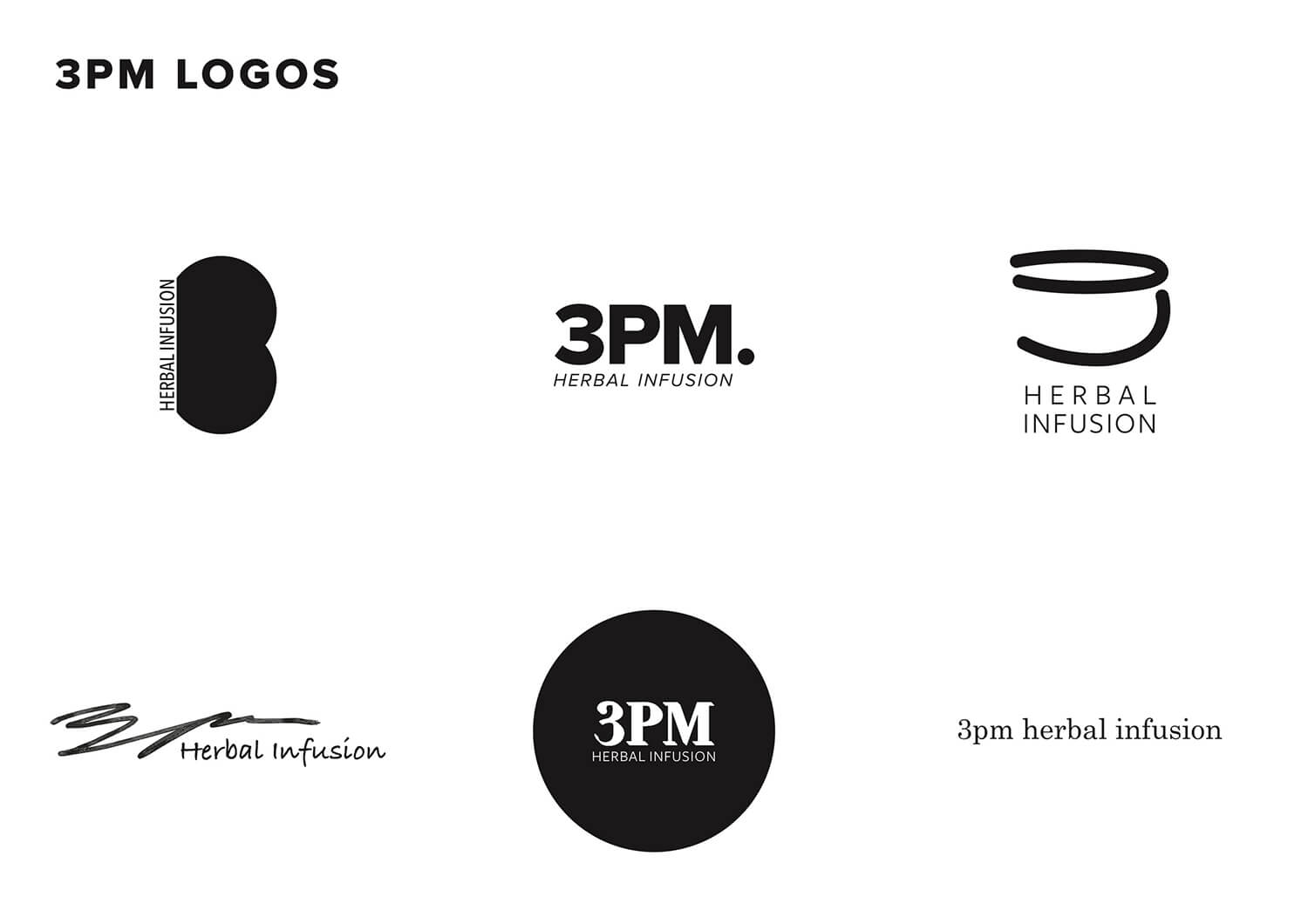
Went with several concepts and narrowed them further.
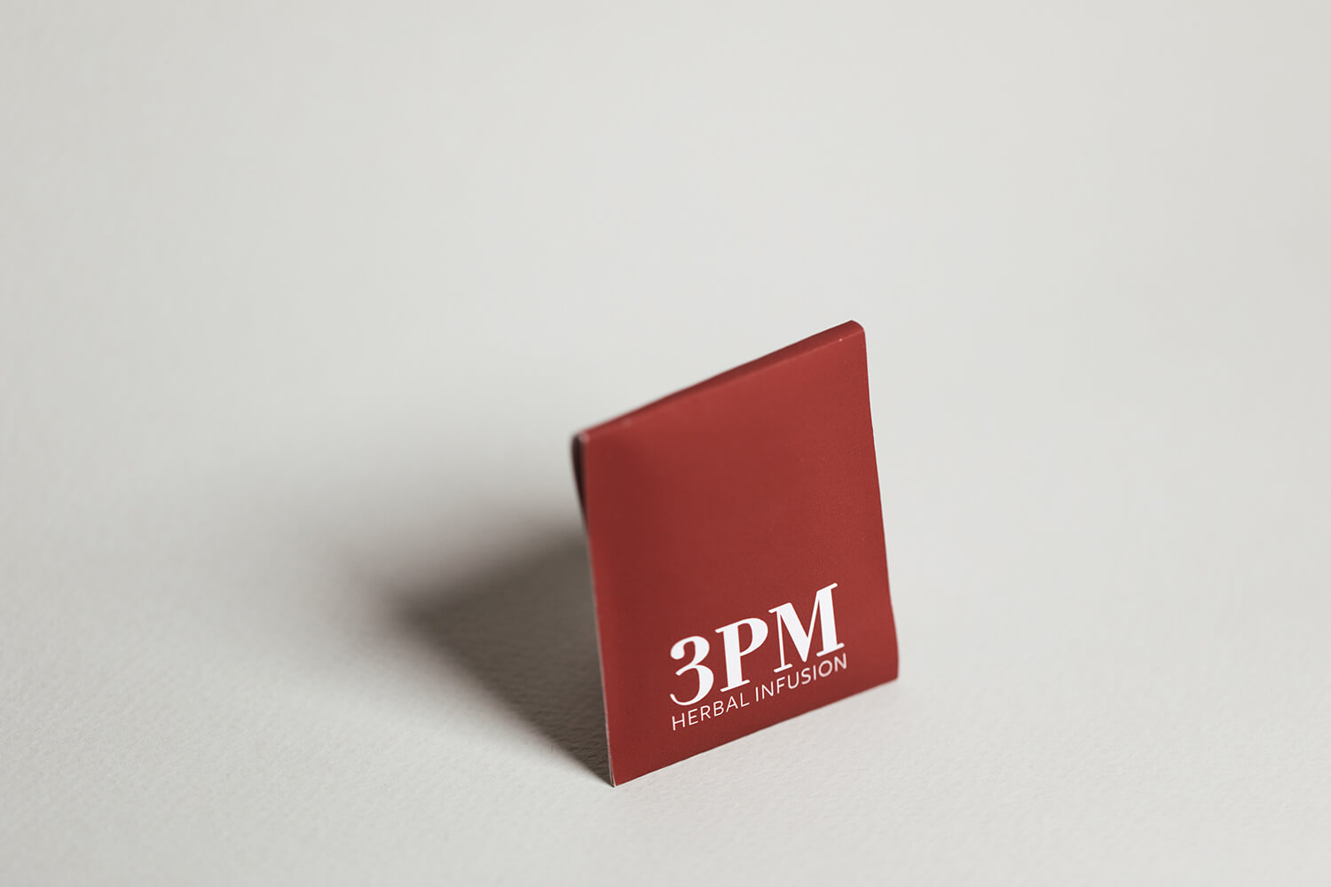
Finalised Logo
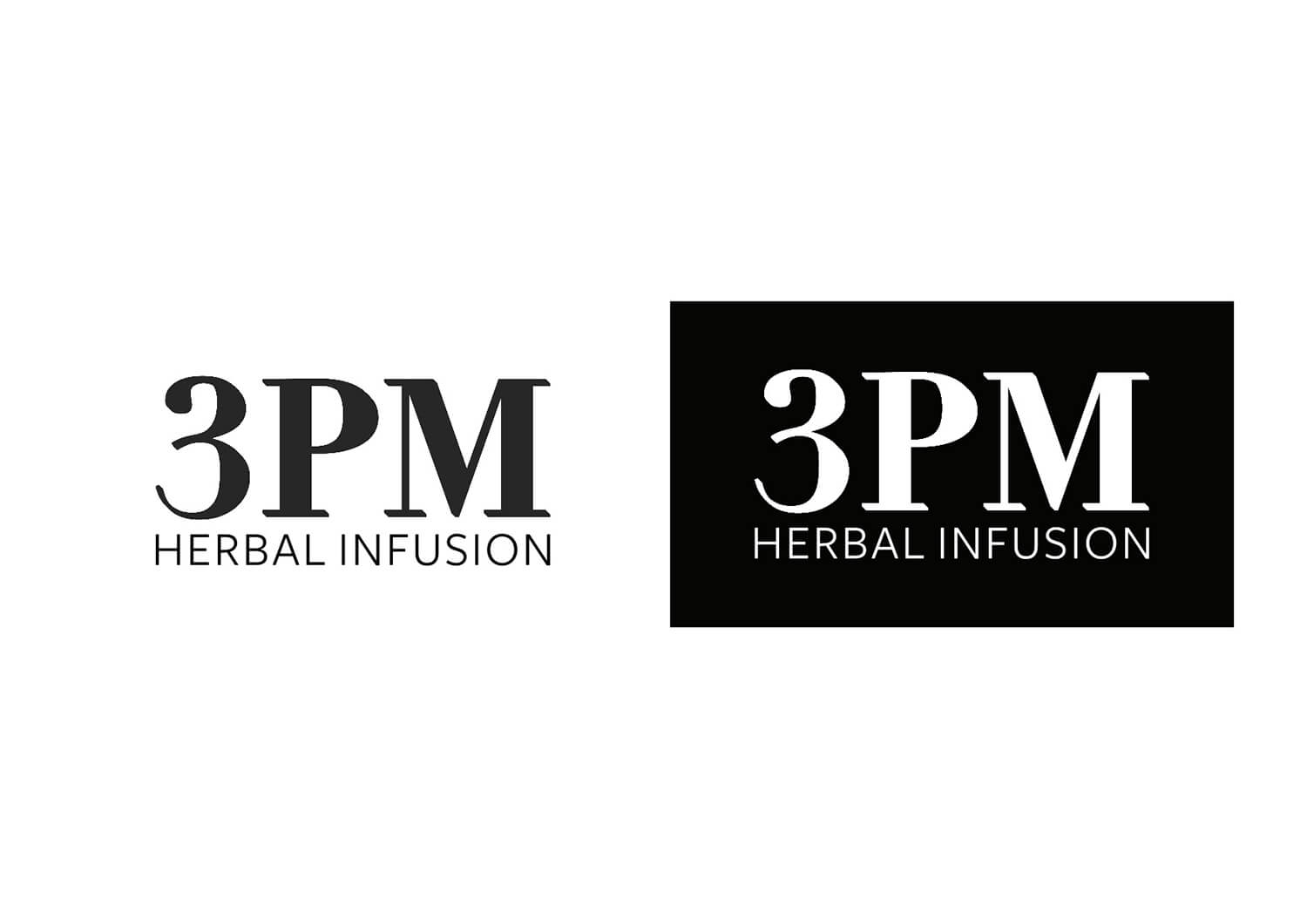
Settled with a serif/sans serif combination, as a nod to the traditional tea heritage and the modern day tea consumption.
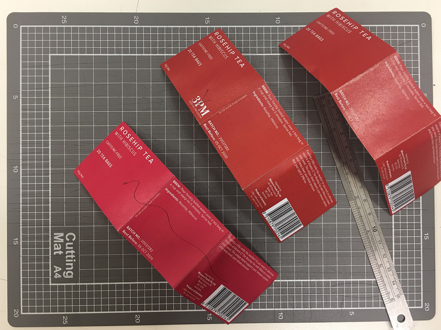
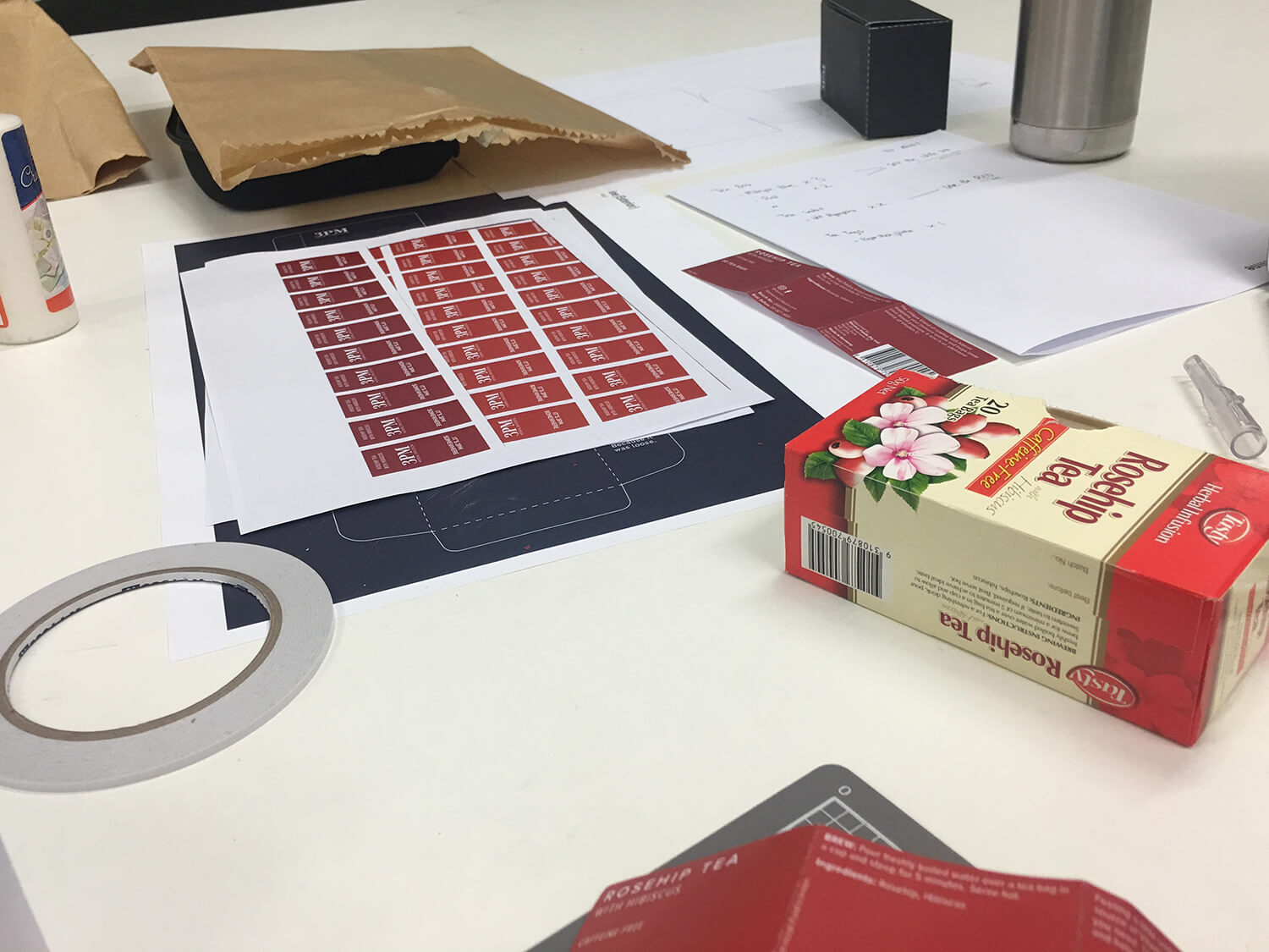
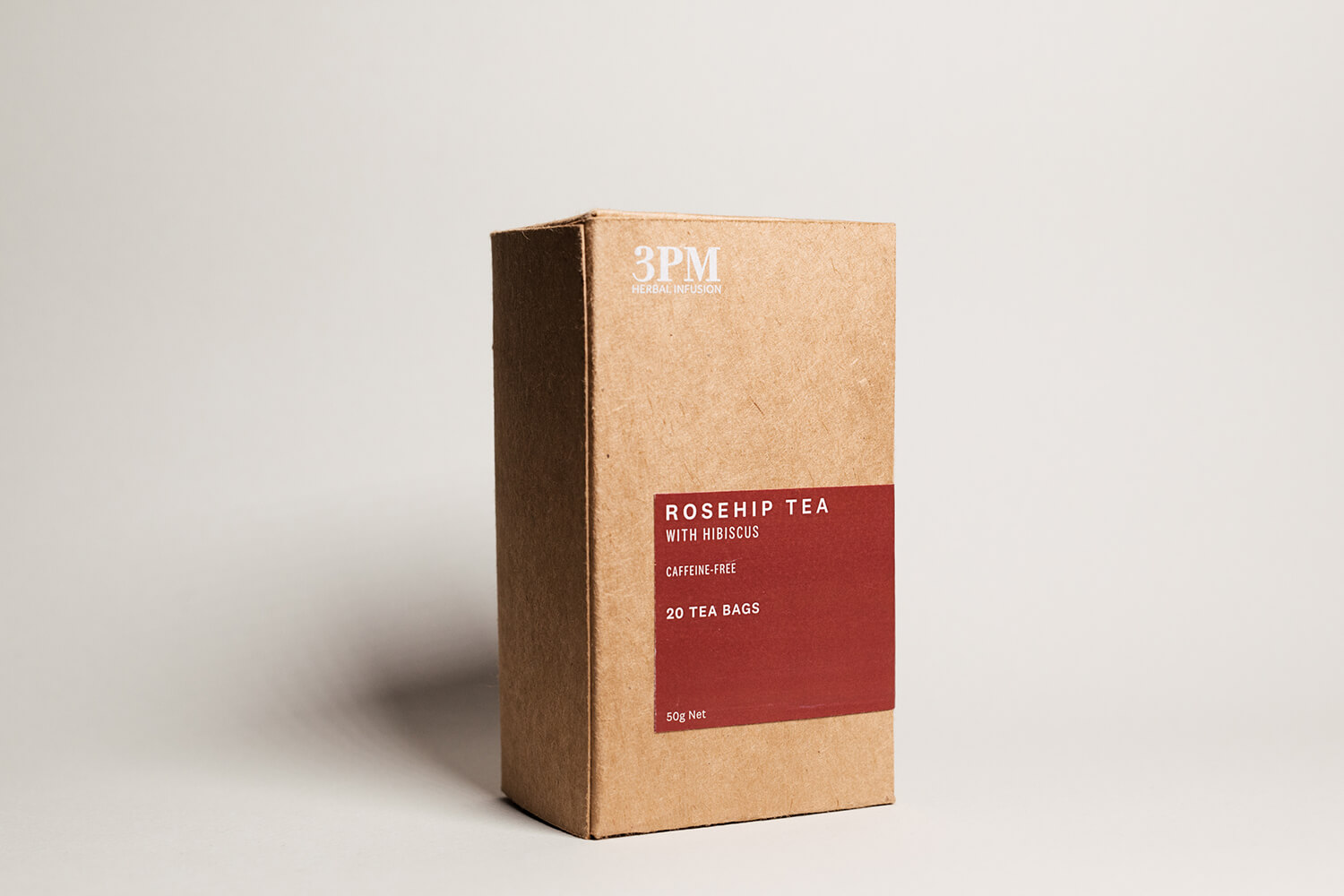
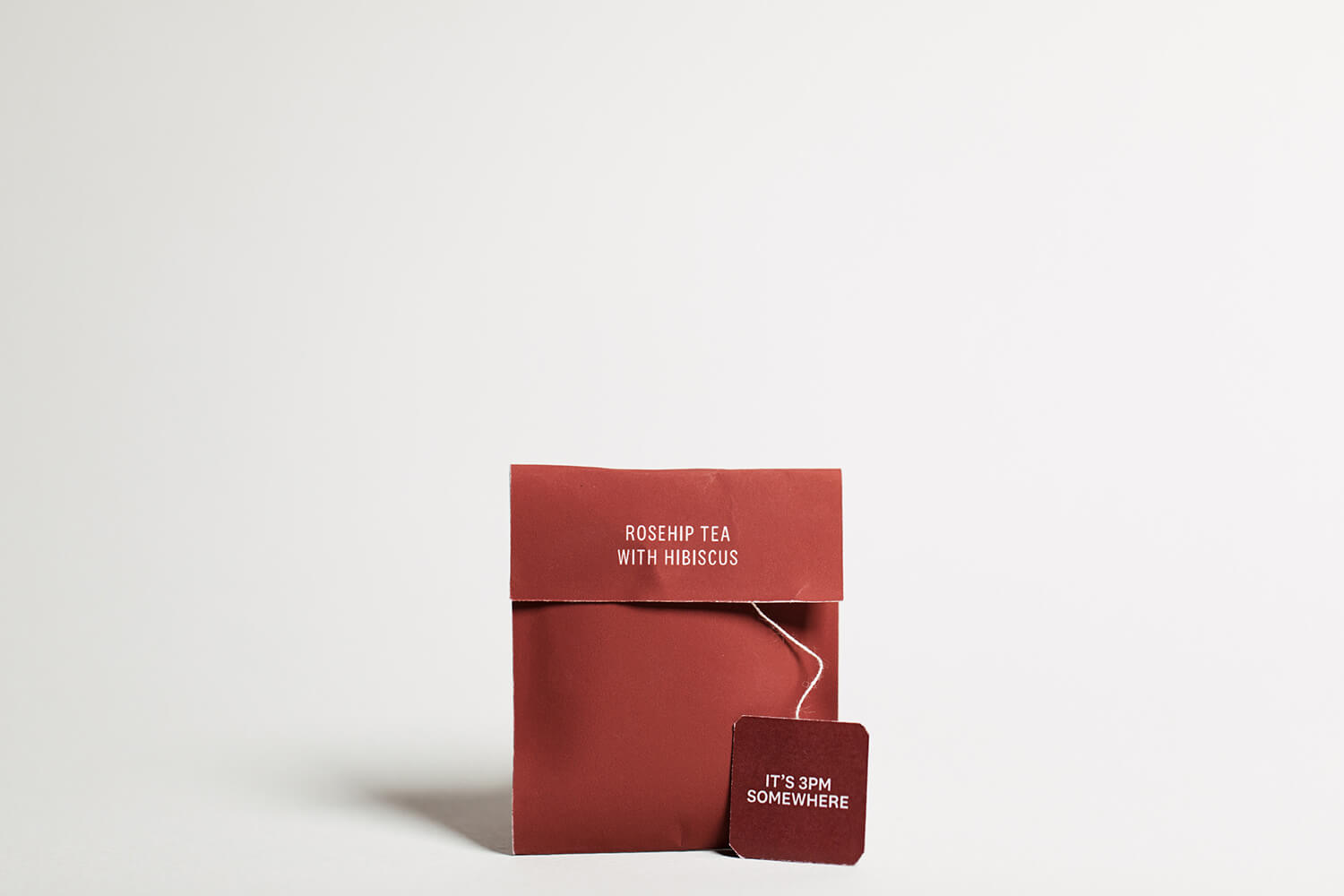
Packaging Development
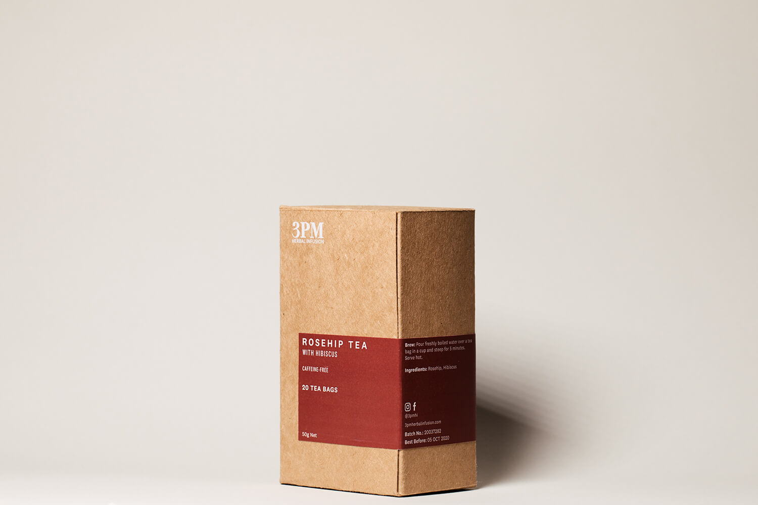
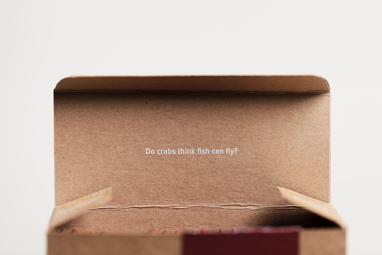
After much deliberation, went with a similar tea box design as I did not want to overthink the purpose of the packaging.
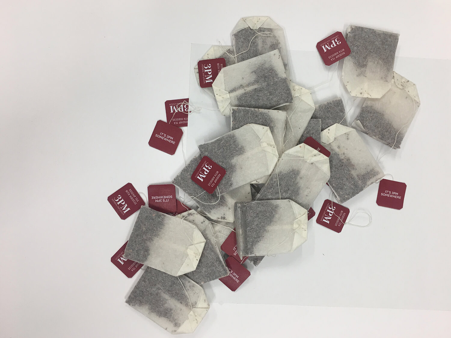
I chose a brownish 'earthy' box as the main compartment and a red sticker label as a contrasting element. Chose to go with a white ink print on the box as well to make the branding subtle yet present.
This being a rosehip tea, I took careful considerations with choosing the right shade of red – deciding to go with a maroon.