Ticketmaster
Reducing Cognitive Load

Ticketmaster Hero Image

Project Type

Responsive Web

Date

2018

Client

Ticketmaster

My Role

Research / UX Design / UI Design / Prototyping / Testing

Summary

Ticketmaster's purchasing system frustrate users. My aim with this project is to identify and remove the pain points with research and design thinking.

What's the Story?

For anyone who buys tickets online may have used Ticketmaster.

This self-initiated university project was borne from the frustrations I faced. With no stakeholders, I had full autonomy on this end-to-end project. This also meant there were no data and analytics, and had to work with what I gathered.

This unpleasant experience carries on through to the app, affecting the brand's reputation. My purpose with this project is to see if I can remove the pain points and make it as seamless as possible.

Where to Begin?

The Old Ticketmaster Look

The Beginning

To validate my project, I started research by conducting an online survey to gain insight and discover the pain points. With the insights, I adopted an agile process to design and deliver a solution.

My Research Findings

  • More than 86% purchased tickets online
  • Less than 15% used the app citing low frequency of purchase from using the app
  • Most did not care which company sold the tickets – they just wanted the tickets

Further Discovery

  • More than 75% purchased their tickets from a desktop browser as they felt it was more stable (than on mobile)
  • [App] Redundant reCaptcha appearing at every step
  • [App] Searching for events are limited to user's current location
Goal:
Improve on the online ticket purchasing experience first
to increase brand's reputation.

The User + Business Goals

Making the purchase as seamless as possible at every touchpoint was the user goal. The business goal was to increase the brand's reputation and thus gain more events under Ticketmaster (growth). Providing additional value once trust and reputation has been built.

Impact

If the goals are met, Ticketmaster will be synonymous with online ticket purchasing (building trust) and an increase in events sold under the brand.

The Challenge

With the gathered insights, next was to distill the problems and turn them into "How might we" questions.

Navigation

How might we make navigation intuitive?

Purchasing

How might we make ticket purchases simple and as seamless as possible?

Discovery

How might we make event discovery easy and pleasant?

Know Your Users

Personas to know who you are designing for

The (Further) Research

Needing to understand the users you're designing for to me is one of the most crucial step in this entire process. This research step helped with my further comprehension of the users.

Competitor's Analysis

To understand the landscape, we needed to know how the competition was doing.

Understanding Target Users

In order to know who we were designing for and their needs, personas were created to better understand their pain points, needs and wants.

Design System

As Ticketmaster already had a design language, the design guide was referred to when making any design element decisions. This was not a rebranding project so no changes were needed to be made.

Notice a pattern?

Online Ticket Sales Competitive Analysis

The Design

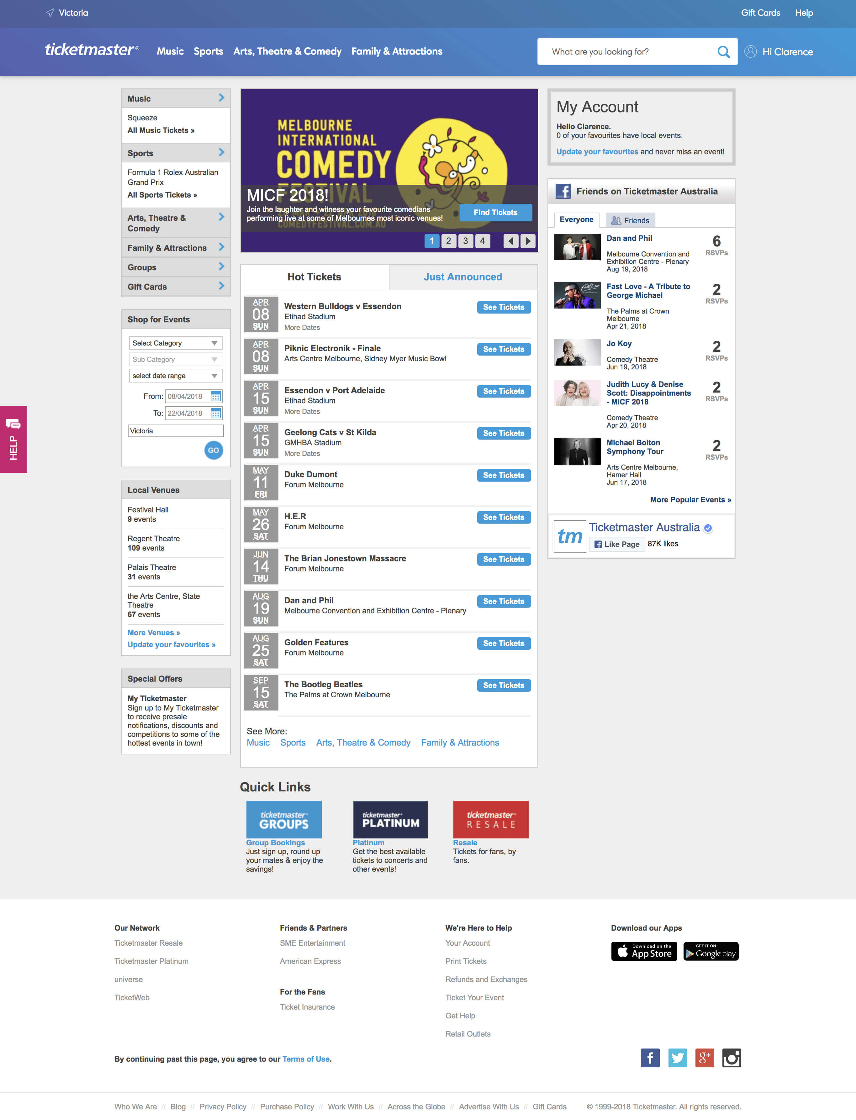
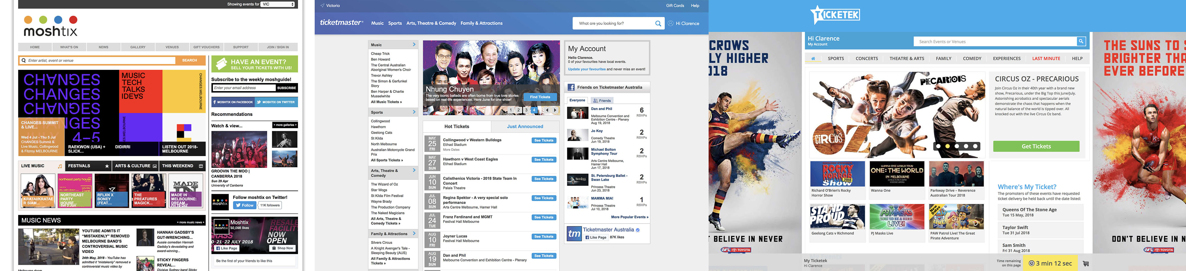
As the website looked dated and the goals were to make event discovery easy and pleasant, along with making navigation intuitive, the layout was modernised without it being too trendy nor too much of a departure.

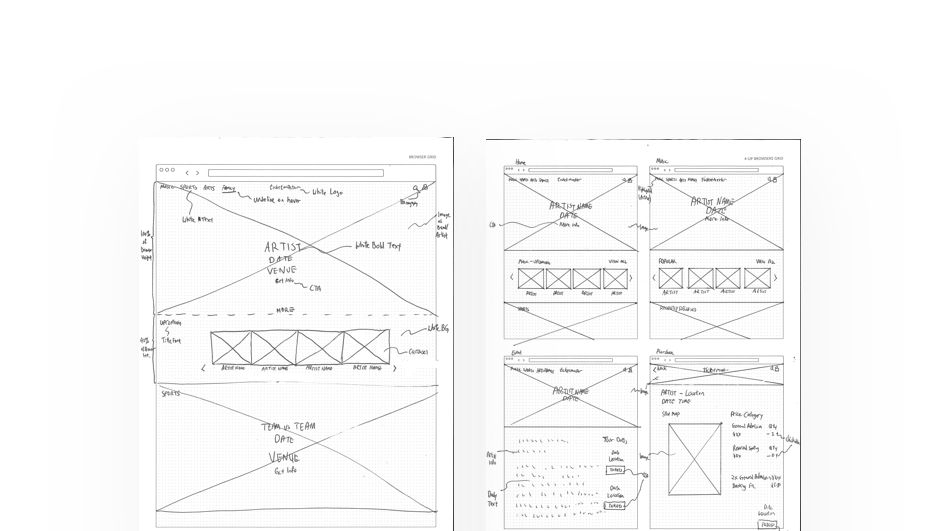
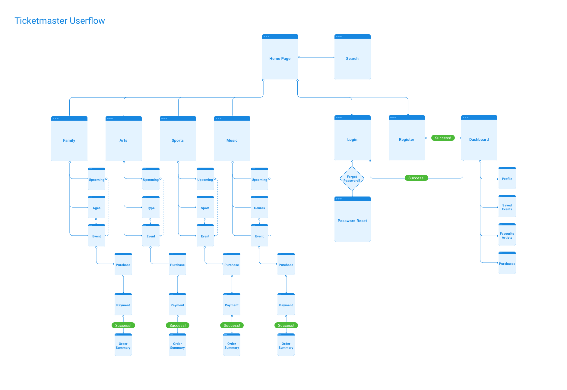
The design phase began by planning out the information architecture and user flow as this step was crucial in making the purchasing process quicker.

Sitemap + User Flow

Ticketmaster Sitemap + User Flow
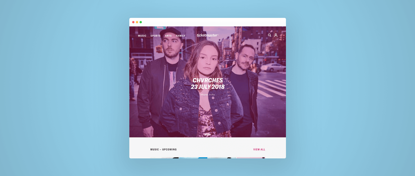
Based on the insight that the website was too cluttered, I simplified the layout, giving the artists and events larger visuals, as people can recognise images quicker than words. I sketched out the wireframes, keeping the users in mind with what they would see.
Ticketmaster Wireframes
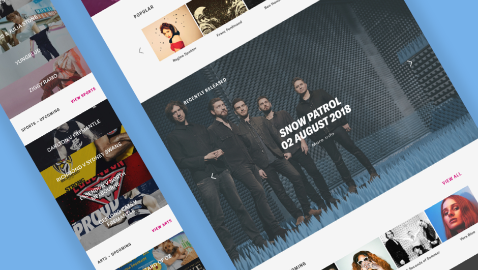
To maintain the same language and visuals, content from Ticketmaster was sourced and used to build the High Fidelity mockups in Sketch.

This also set up a template for events to create a more cohesive experience for users throughout the site.
Ticketmaster New Look
By removing the visual clutter, this not only made the website quicker to load, but reduced the cognitive load which in turn made it easier for users to navigate.

The Delivery

Since there were no stakeholders nor product managers to run this by, it went straight to user testing for feedback.

The goals for this project was to remove the frustrations in ticket purchases and making it easier to navigate the site. This was tested during the feedback by means of an InVision prototype.

Observing how they interacted with the prototype and noted any instances when they were confused. After they have completed a set task, I surveyed them on their experience. Most of them preferred this redesigned version as they found it easier to navigate and intuitive for them.
You'd be hard pressed to find a one-size-fits-all solution.
Find the one-size-fits-most.

The Feedback

There were a few constructive criticisms, I learnt that I can never take feedback to heart and it's always to hear the users out.

  • Needs more depth, everything looks a little 'flat'
  • Credit card screen needs to look more 'secure'
  • Could add an event reminder calendar link after purchase
  • Typography could be more 'dynamic'
  • Too simple for me

The Wrap-up

Based on the feedback, I managed to solve the problems and made ticket purchasing a little more fuss-free. Now would be to work on the feedback and iterate.
“Hey Google, purchase 2 tickets to the next Wiggles concert in Sydney.”
If I could take this project further, I will innovate further by working with a visual interface-less medium – Voice. Imagine buying tickets would be as easy as giving a voice command.

I like to push the design boundaries, but I understand that I am designing for the users, not myself. You have to design for what the user needs. Catering to a large demographic can be challenging and not everyone will be satisfied with your design. At the end, you do not want to cause more frustrations and alienate users. It is about finding the right balance between business and design constraints.

Key Takeaway:
Always test and validate your assumptions, people do things differently even though it's the same task. Everyone is different.