
TL;DR
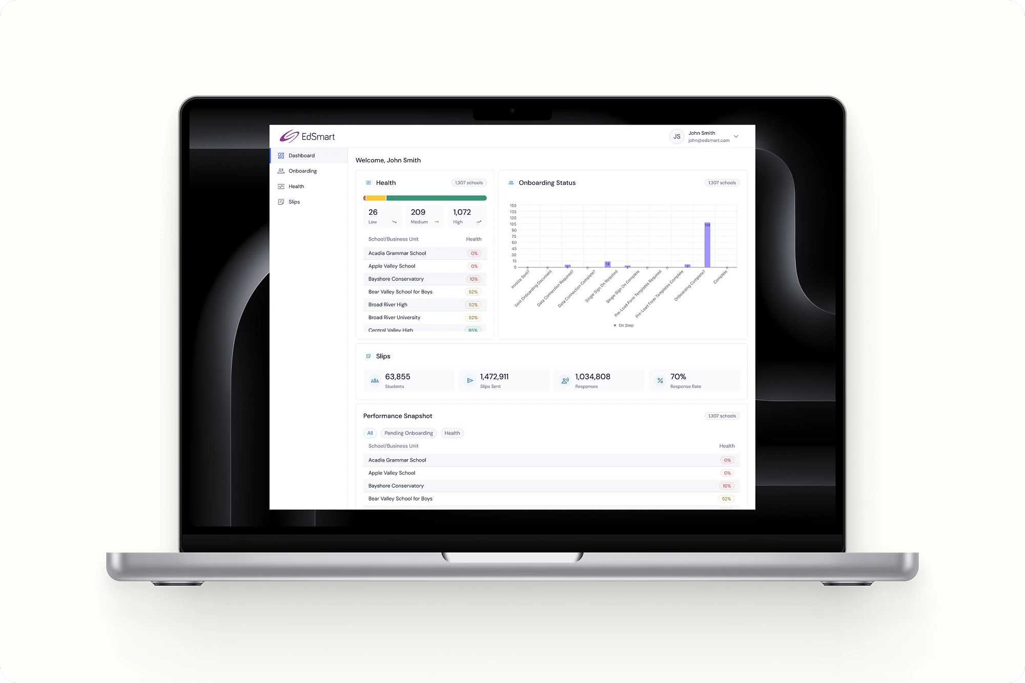
Took a greenfield enterprise platform with no shared design language and turned it into one coherent, systemised experience for the administrators who run whole districts from it.
- 0 → 1
- design language (none, to a foundational system)
- 5
- modules unified (including dashboard, onboarding, tasks and slips)
Workflow
Fix the screen, then fix the system.
I evaluated the product module by module, then pulled the fixes into a shared design language the whole platform could grow on.
The brief that wasn't simple
EdSmart makes software for schools. EdSmart Enterprise was a new, larger product built for the people who run things at the district and multi-school level: administrators who live in dashboards, track the health of dozens or hundreds of schools, and can't afford to misread what's in front of them.
I joined as the product designer on this build. The brief sounded simple and wasn't: design a consistent, intuitive interface for a platform that didn't have one yet.
No language to build on
Because Enterprise was a greenfield product spanning an entire suite, there was no existing design language and no component library to build on. Every module had been designed in isolation, so the same idea looked and behaved differently depending on where you found it.
For an administrator, that's not a cosmetic problem. Inconsistent layouts and shifting interaction patterns mean a steeper learning curve, and a real risk of missing something important in a tool where missing something has consequences. The product worked, but using it cost more mental effort than it should have.
One constraint shaped everything: this was a new build with no baseline usage data. I couldn't lean on analytics to tell me where people struggled. I had to find the problems by evaluating the product directly and testing with users, not by reading a funnel.
The ring graph hard to read
I started with heuristic evaluation to find where the inconsistencies and friction actually lived, then worked the fixes back into a shared system: colours, typography and components that every module could draw from. The point wasn't to make screens prettier. It was to make the same thing look and behave the same way everywhere, so people could stop relearning the interface.
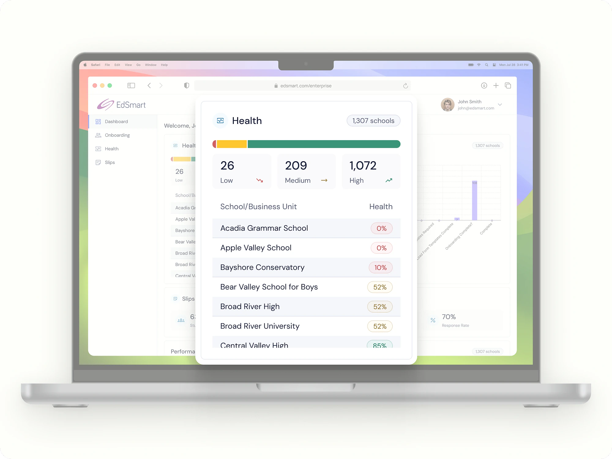
The clearest example was on the main dashboard. School "health" was shown as ring graphs, and in testing those rings were consistently misread. People couldn't tell at a glance which schools were fine and which needed attention, which is the one thing that view exists to answer. I replaced them with a flat bar graph. It gives immediate visual confirmation of status and surfaces the schools that need attention without the reader having to decode anything.
Fix the screen, then the system
The same thinking ran through the rest of the work. On the onboarding view, I reorganised the hierarchy and grouped related information so administrators could track progress without hunting for it. On task management, an ambiguous double call-to-action was causing hesitation and errors, so I simplified the logic to a single clear action. On slip creation, I added a template preview and a step indicator so people could see where they were and what they were making, instead of guessing and reworking.
Small changes, but in a complex environment small changes compound. Each one removed a little friction; together they made the product feel like one thing instead of many.
What changed
The headline outcome is the system itself. Enterprise went from having no shared design language to having a foundational one: scalable patterns and components the product could keep growing on, rather than a set of one-off screens.
The interface-level improvements were validated through internal usability testing rather than live metrics, which is the honest limit of what I can claim here. People understood the flat bar graph immediately where the rings had tripped them up, moved through tasks with less hesitation, and made fewer errors on the actions they did most often.
Two things stuck with me. First, that establishing a design system early is one of the highest-leverage things you can do on a complex product, because consistency is what lets people stop thinking about the tool and start using it. Second, that you can design well for users even without baseline data, as long as you're willing to evaluate honestly and test what you make.
What I'd do differently
Enterprise went to market after I left EdSmart, so I can't point to how it performed once real administrators were using it day to day. That's the honest gap in this story. The interface work was validated through usability testing, which tells you people understood it, but not whether it changed behaviour at scale. Next time I'd want to be there to close that loop, and I'd build measurement into the work from the start rather than treating it as something that happens after launch, so the design's impact is provable and not just plausible.
What surprised me
The harder problem wasn't the design, it was the process. The platform's modules had been built by developers working in silos, and aligning them around a single shared system took as much effort as the design work itself. A design system is only as real as the team's willingness to adopt it consistently, and getting there is as much about alignment as it is about components.