
TL;DR
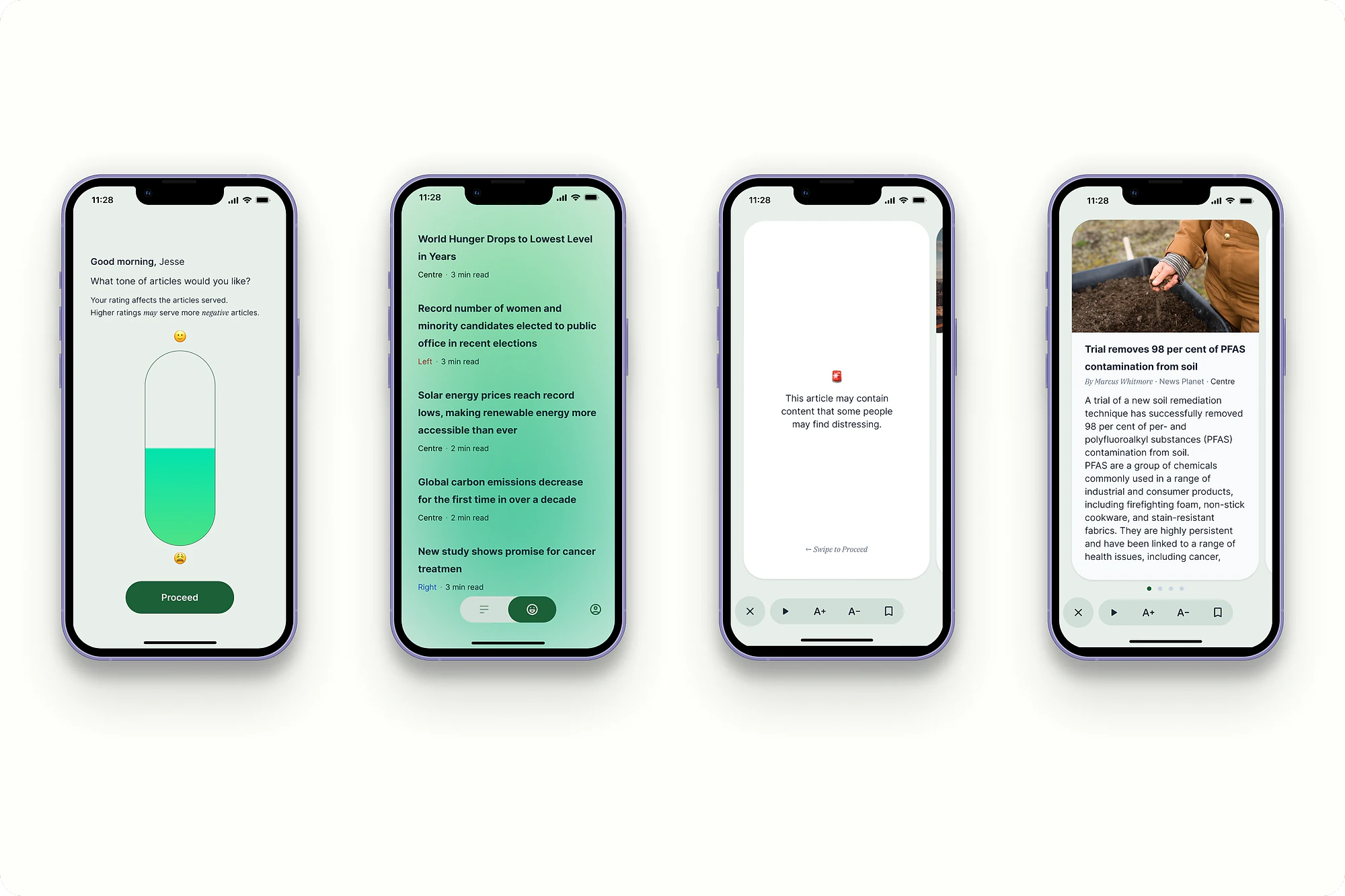
A self-directed concept for a news app built around how you feel, not how long it can keep you scrolling. The core idea: a mood check-in that adapts what you're shown to your state.
- Conceptself-directed, not shipped
- Soloresearch, design, prototype
- Adaptivebuilt around emotional state
Workflow
Research, concept, reaction — on repeat.
The concept only got sharper by cycling through surveys, design and informal feedback more than once.
Why I built this
Mindy is a self-directed concept project, not a shipped product. I built it to explore a question I kept coming back to: what would a news app look like if it were designed around how you feel, instead of around how long it can keep you scrolling?
I'm including it here because the core idea, adapting an experience to a person's emotional state, is the thread that connects most of the work I care about. It's the same instinct behind designing for a stressed commuter, or a traveller having a bad day. Mindy is where I got to chase it on its own terms.
The problem with the feed
Most news apps are built to maximise time spent. Endless feeds, a constant flow of mostly negative stories, no natural place to stop. For a lot of people that adds up to feeling overwhelmed, caught in cycles of outrage and fear, and losing track of time without feeling any better informed.
I looked into this through online surveys, a read of academic work on how media consumption affects wellbeing, and a competitive scan of existing apps. A few clear needs came out of it. People wanted control over how much news they took in. They wanted ways to limit exposure to genuinely upsetting stories. And, the insight the whole concept turned on, their mood shaped what kind of news they actually wanted to read.
News that reads your mood
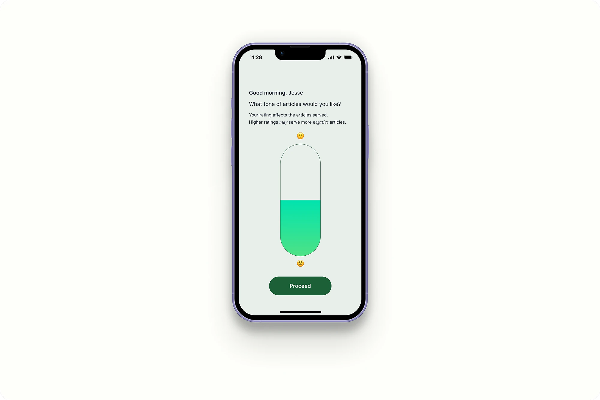
The central idea in Mindy is a mood check-in. At a few points in the day, the app asks how you're doing, and adjusts what it shows you based on the answer.
On a calm day, it offers deeper, more demanding topics. On a stressed day, it filters out negative sentiment and keeps things lighter. The point isn't to hide the world from you. It's to let the experience meet you where you are, so reading the news becomes a deliberate act rather than a compulsive one.
Built to have an end
Two design choices supported that. The interface is deliberately minimal: generous white space, legible type, no infinite scroll, no notification noise. It's built to have an end, so you can finish and put it down. And a set of control and accessibility features back it up, customisable content categories, text-to-speech for listening on a commute, and explicit trigger warnings before sensitive stories, so the reader stays in charge of what reaches them.

What it taught me
Since Mindy is a concept, the honest output is what I learned rather than a launch metric. Informal feedback sessions were the most useful part, and they validated the central bet: people responded to the idea of news that adapts to their state, and the calmer, finite interface was the part they reacted to most.
A few things became clear in the process. News is a genuinely hard domain, full of bias and deep habits, and design alone won't shift how someone consumes it without their own motivation to change. Early, informal feedback was worth more than any amount of polishing in isolation. And the work was non-linear: the concept only got sharper by cycling through research, design and reaction more than once.
If I took Mindy further, I'd explore leaning into uplifting news as a primary mode, and I'd have to deal honestly with the ethics underneath a news product: where the content comes from, and fair compensation for the people who make it. Both are real questions, and a concept is the right place to surface them rather than pretend they're solved.
What I'd do differently
Mindy was validated only through informal feedback, which is enough to tell me the idea resonates but not enough to trust it. The mood-adaptation is the whole concept, and it's also the riskiest part, because "show lighter news when someone's stressed" is an assumption dressed up as a feature. Before believing it, I'd test it properly: real content, real users, over enough time to see whether adapting the news actually helps or just quietly narrows what people see. A concept earns the right to become a product by being tested, and this one hasn't been yet.