designguide.Melbourne
Building a Portal

designguide.Melbourne Hero Image

Project Type

Responsive Web

Date

2018

Client

designguide.Melbourne

My Role

Research / UX Design / UI Design / Prototyping / Testing

Summary

designguide.Melbourne is an online portal for creative/design events and is community for creatives in Melbourne.

What's the Story?

If your plans for the weekend were suddenly cancelled, what do you do? Perhaps look for a replacement activity. And if you wanted to do something creative, where will you end up looking? Eventbrite or maybe even searching “Creative events this weekend”.

This is where Melbourne Design Guide [MDG] comes in. It is an event portal for creatives. This is a hypothetical product and part of a university project.

The Beginning

We began with research by conducting interviews with creatives we know. Asking them about their motivations in attending events. Here are a few of the questions (amongst others) posed:
their expectations from attending an event, how much they’re willing to pay for an event and what kind of events they like to attend.

We compiled the interviews into a database for everyone on the project as reference. This helped with forming our personas and identifying edge users.

Our Research Findings I Found Interesting

  • More than 70% only attended free events
  • 20% are not willing to travel more than 15 minutes to get to the events
  • More than half wanted a discovery feature
  • Over 90% wanted to quickly search for an activity upon landing
  • Over 65% browsed for events on their phones
Goal:
Build a portal for creative to easily and quickly look for events and form a community for like-minded people.

The User + Business Goals

The goal of the user will be to look for events easily, with their own requirements. The business goal is to create a community for creatives – bringing like-minds together.

Impact

If the goals are met, Design Guide can be used worldwide as a platform for all creatives.

The Challenge

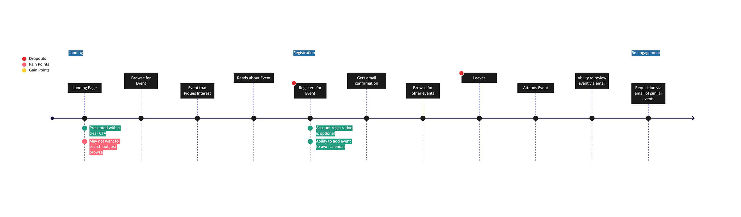
With the gathered insights, our next step was to address problems with “How might we…” statements.

Discovery

How might we make it easy for people to search for an event?

Preference

How might we let people look for events that will suit their needs?

Revisiting

How might we get people to come back to the portal.

Know Your Users

Sean, a keen business owner

The (Further) Research

Since this was a new product, we needed to establish and define the users we were designing for. Needing to understand who we were designing for is a crucial step in this entire process.

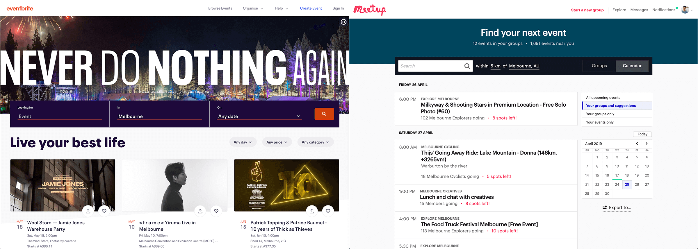
Competitor's Analysis

There are other similar products out there but nothing like design guide. Finding out what works (and what doesn't) will help guide the design process.

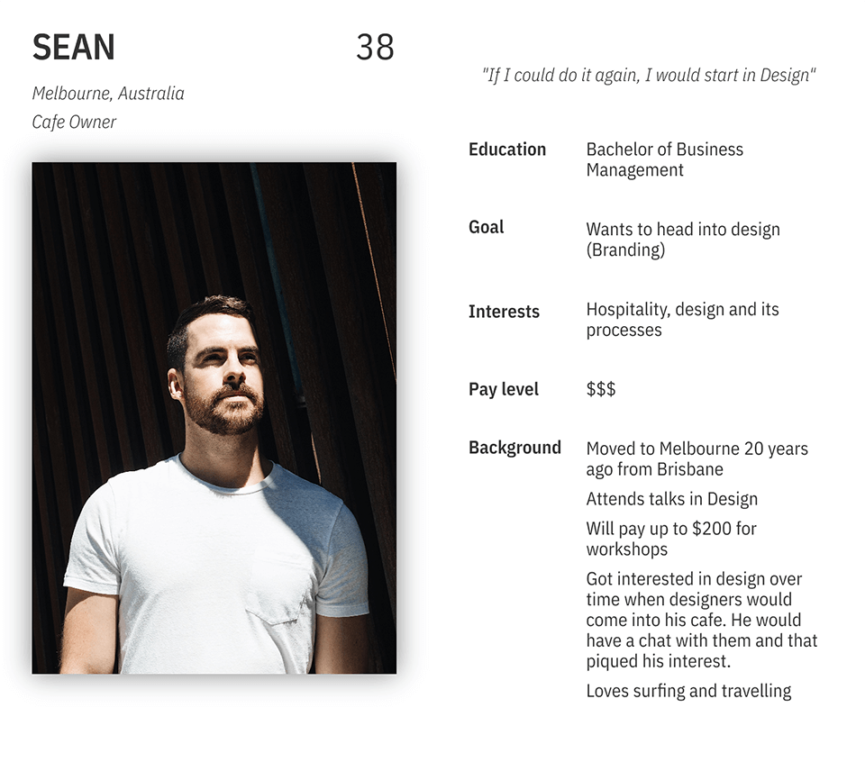
Understanding Target Users

Once we had gathered the interviews, it helped to form a clearer picture of our users. As people had different uses, personas were created to better understand their pain points, needs and wants.
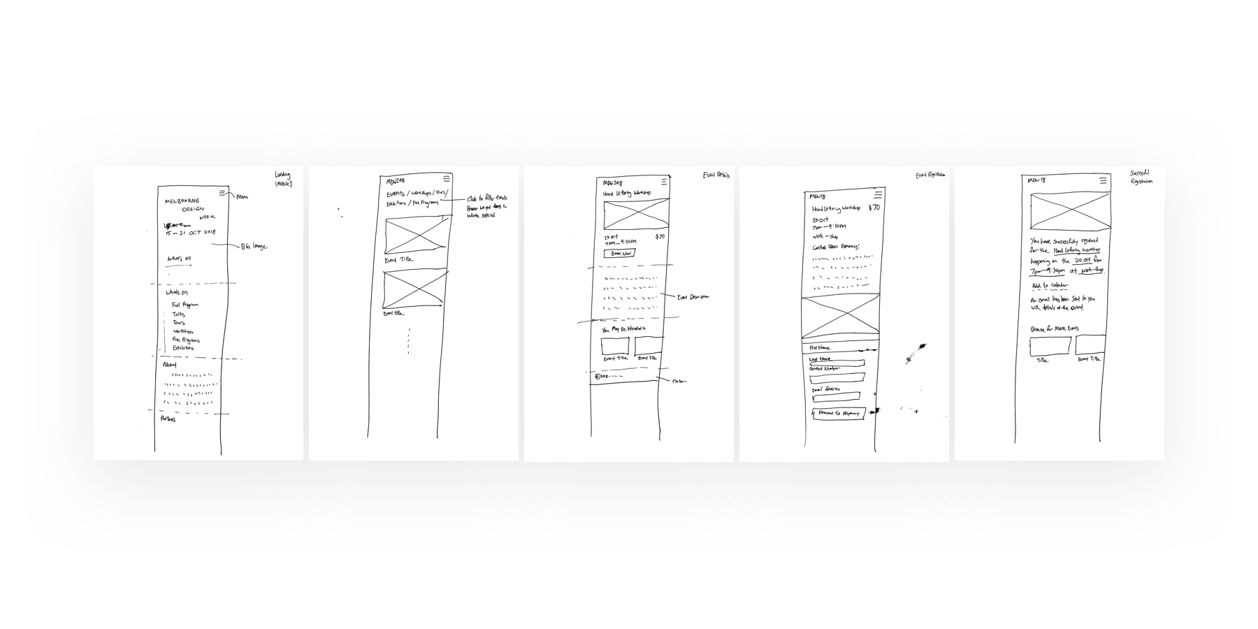
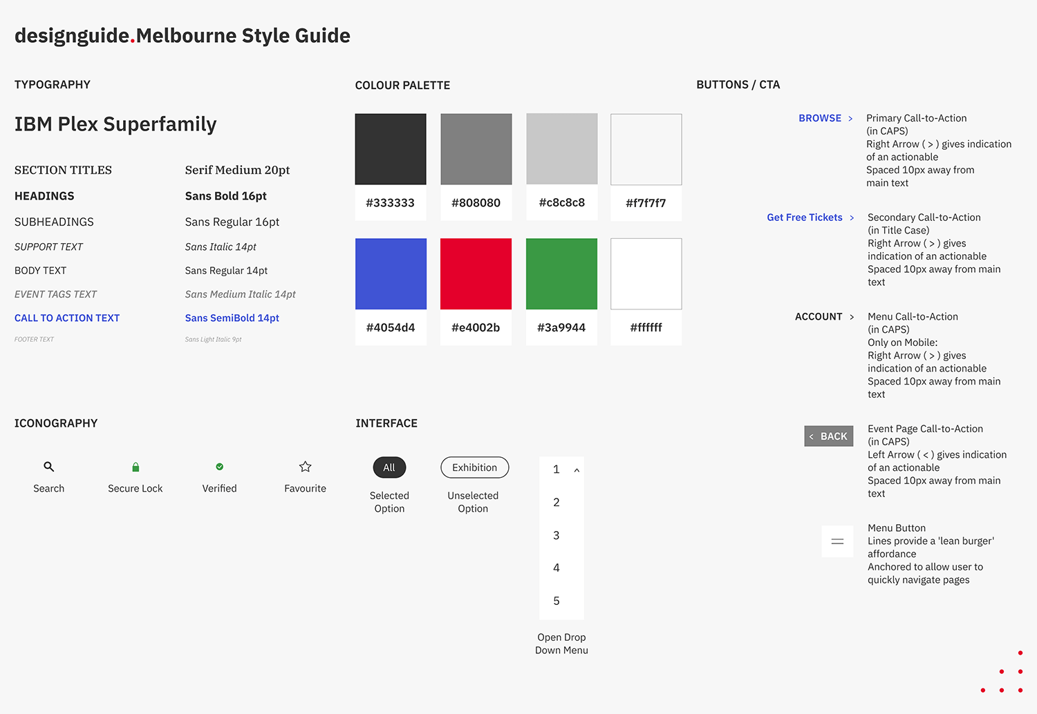
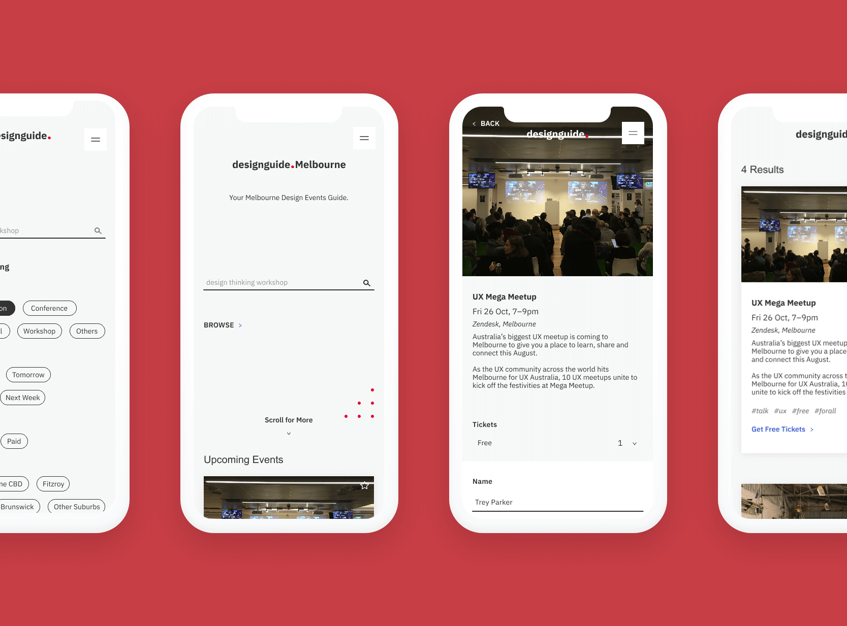
Design System

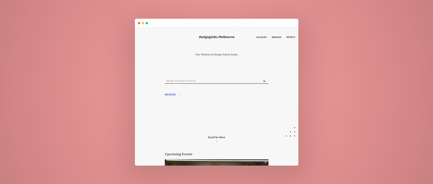
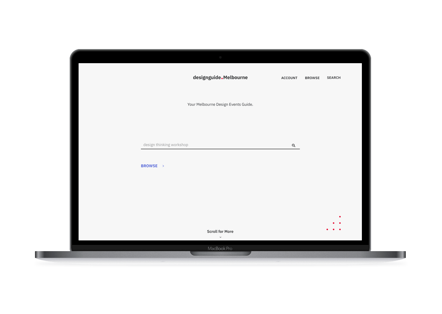
Since MDG was a new product, I saw an opportunity for branding. I went with designguide.Melbourne, as the ‘designguide’ name can be used for different cities and be part of a larger business.

Part of my role was to establish a design system, drawing from the Atomic Design Methodology. I incrementally created individual elements to fit it into a new design ecosystem.

Finding Things To Do

Eventbrite and Meetup

The Design

As the users will be mostly creatives, I wanted an interface that had to appeal to a broad range of this demographic. The design had to be efficient and not steal too much attention away from the events.

Looking for something to do had to be simple and not frustrate the user. Since search was a highly requested feature, I decided to have the search function be front-and-centre on the landing page.

Following that, registering for an event must be quick, easy and seamless. Discovery for other events have to be simple too.

Mapping their Journey

MDG Journey Map
During research, over 65% of creatives browsed for events through a mobile device. Which was why I decided to design mobile first. It was crucial to quickly engage new users and set myself up in designing for a responsive web. With the users in mind, I began sketching out a rough layout on pen and paper.

Mobile First

Designing Mobile First Sketches
As this was a new site, I saw an opportunity to set up a design system to assist with building the site quicker in the later stages. Applying the atomic design methodology, I built the components from the smallest component to the larger ones. Ensuring that the components could work harmoniously together.

This brings about a more cohesive experience for users throughout the portal.
Design Guide's Design Guide
My intention with having a greyscale colour palette for the site (aside from the CTAs), is to put more focus on the content – the events. Reducing the visual load users may face.

This design system can be iterated over time and it serves as a first version of a new ecosystem.

I wanted the search feature to be prominent yet not too distracting so I opted to go with a line as the text field. With a suggested search term to assist with quicker onboarding and to get users to use the site easily.

I decided to use ‘tags’ so that people could easily gather quick essential information about the event, e.g. #forall, #free, #ux. This also serves as search terms.
Designing Mobile First Sketches
Next was designing for the desktop web. With the frameworks all in place, it was easier to adapt to the larger screen.
Design Guide's Design Guide

The Delivery

As this was a new product and no stakeholders to run this by, I was able to test out the site with a select few people and gather their feedback.

Giving them specific tasks to complete and observing how they would navigate the site. Gathering feedback and opinions of the site and if they had any issues.
Does a creative portal need for it to be visually heavy, full of colours, animations and effects?

The Feedback

Some people are more visual than others. They want to see colourful elements going on throughout the site.

While I do not disagree, I was focusing on the structure, layout and flow of the site which I prioritised. Here are a few of those feedback:

  • It needs a bit more brighter colours like a deep violet/purple
  • A more obvious CTA button may work better
  • Could use a more playful type
  • Too simple for me

The Wrap-up

It can be seen as a rather niche market, focusing on just creatives. But the idea behind this product is exactly that. Not only will this be for creatives, it is meant to form a community. An event site as a MVP, is only the first step. Next will be having a forum where creatives can share their experiences with the events or create new events.

One thing I believe could have been done better was using data and analytics, which was omitted during research. A better understanding of the events that people attend could help craft a better experience. An example will be if an event provides food, the organisers need to know the dietary requirements of their attendees. Insights like this could help make it easy for both attendees and organisers.
How to build a community?
Start with something that brings people to it.
Taking this project further, I will add a review function to events, profile for people who post events – just adding a more human element to the site to set up the community creation part.

Key Takeaway:
Listen to feedback and validate your assumptions. Your assumptions may not be right.